Project Description
This project challenged me and my team to identify an issue on our university campus and create a product that provides a solution. The problem that we identified was the lack of a centralized location for all resources available to students. The solution we created is called Boiler Browse. Our focus was on free resources and events around campus to improve student life at Purdue by allowing students easier access to fun events, education, and other perks that come for free with being a student.
Personal Contributions
Full high fidelity prototype for website made on Figma, sketching the web design, primary research through cognitive walkthrough interviews, conducting co-design workshops, affinity diagramming, converting prototype from Figma to code, usability testing
Features List
These are the main features that make our final product stand out.
Home Page
- Personalized calendar that shows all meetings for the current month associated with clubs/organizations that the user follows.
- A favorited list of all the clubs/organizations the user is a part of.
- A list of free food or other free goods that are being given out around campus that same day.
- A scrollable list of all upcoming events from the clubs/organizations the user is interested in.
Events Page
- A scrollable list of upcoming events that is organized according to date to provide a centralized and easy place for Purdue students to explore all the free events they could participate in.
- Option to post an event that the user's club/organization might be hosting to easily promote it. This also ensures it's easy for organizations to keep this information updated.
Free Courses Page
- A list of the free educational courses
- List of workout classes
- List of tutoring sessions
Research showed that many didn't know this courses exist and raising awareness can improve students' overall educational experience.
Hours Page
- Centralizes all the operational hours for the main buildings on campus that provide free resources such as
- the community gym and pool
- Knowledge Lab (a place with access to creative materials and quality printers)
- Study rooms, etc.
This information is already available online but is not very easy to find as it is scattered across many sites. This makes it easy for new students to plan their day, which improves overall campus experience.
Initial Ideation and Research
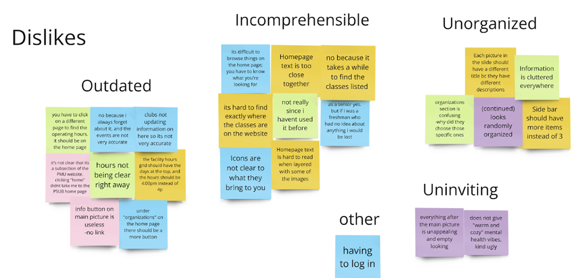
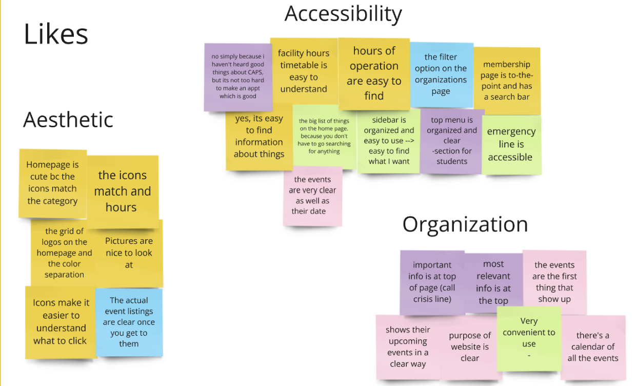
Once the team had decided what school issue to tackle, we had to conduct some research to build an effective solution. First we did some secondary research to compile all the resources that exist already on campus. We used this list to decide which ones were most important to the daily lives on students. Once we had condensed the list to about 5-10 options, we conducted a co-design with current Purdue students to gain an understanding of the usage patterns of various Purdue resources. Through this co-design, we wanted to gather insights into student preferences and improvement areas in these existing platforms. We worked towards this goal by having our co-designers list their thoughts on some of Purdue’s most popular websites, including what features they like, and what features they would change. These are the results that guided us in moving forward with the project.

Dislikes from Co-Design Workshop

Likes from Co-Design Workshop
Sketches and Ideation
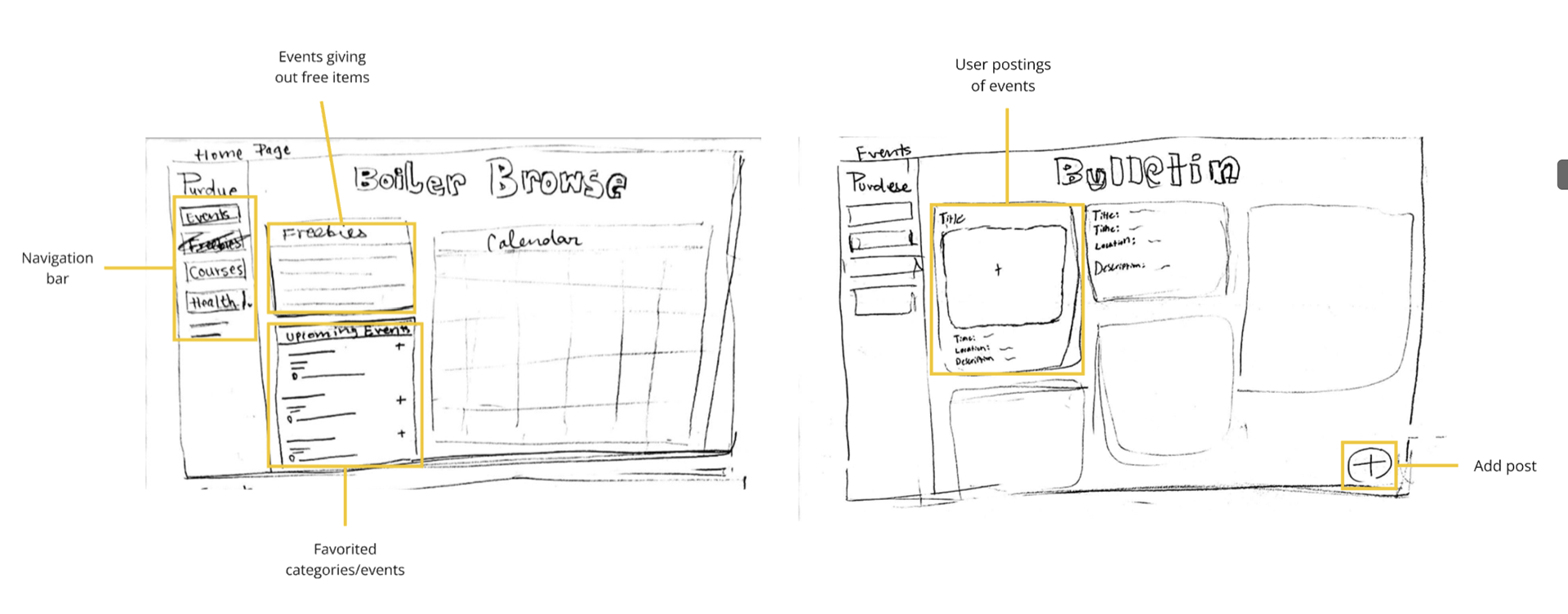
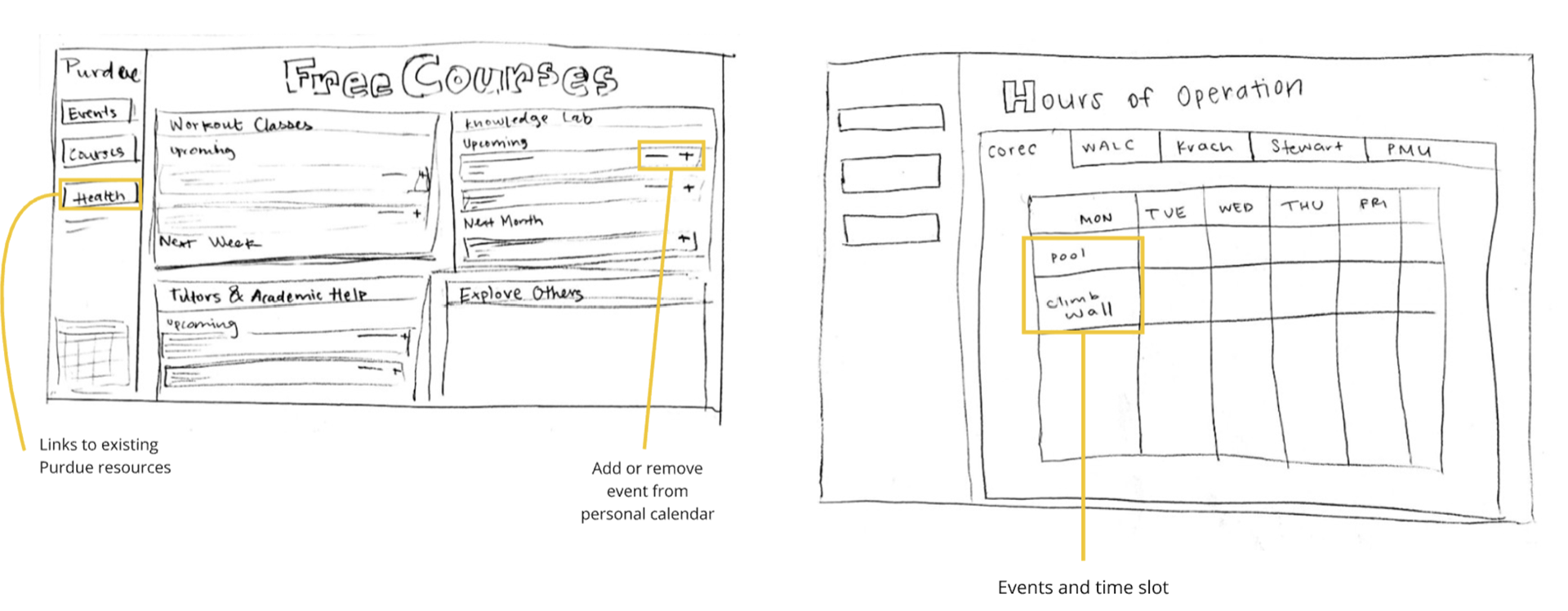
Knowing what features would be the most useful to Purdue students, I got to work sketching out some ideas of what the ideal website would look like.

Initial Sketches Labeled

Initial Sketches Labeled
The design went through many changes and improvements based on feedback we got from stakeholders during the design process, but the ideas expressed in the sketches showed through with the final product and were overall received positively by focus groups and stakeholders.
Usability Testing and Feedback
We conducted usability testing on our high-fidelity design to evaluate the efficiency of the website in guiding users when accessing campus resources. Our participants were the same individuals who were involved in the co-design to help us identify whether the improvements made in the design aligns with their needs.
During the testing, participants expressed confusion over the difference between the Favorites and My Events section. To clarify the sections, we changed the wording of "Favorites" to "My Organizations."
Another feedback was the lack of size difference between Favorites, Freebies, and My Calendar section. We decided to enlarge the "My Calendar" section to make it the focal point of the page as the participants valued it the most.
Additionally, there was confusion over why all of the events displayed time and date besides the Freebies section. To address this issue, we added time information to this section, ensuring a consistent design throughout the page.
Lastly, participants struggled to navigate back to the home page due to the absence of a dedicated home button. To streamline the navigation process, we added a separate home button above the events button, rather than relying on the Purdue logo as the home button.
Limitations and Final Takeaways
The main limitations of this website was converting the prototype to code in an efficient way. We tried a few different options by recommendation of our professor, but it would have been simpler and more effective to try and code it ourselves. The time restraints on the assignment also made it difficult to carry out a task like that so we tried to get creative in the ways we convert the prototype to code such as using plugins like Anima, re-creating the whole prototype on Adobe XD and export it as code, and transferring the SVG files from Figma to web prototyping platform and add in all the interactivity/responsive elements again. All these options were very time consuming and were not executed in an ideal way.
But all the difficulties with exporting and coding taught me a lot about the code that would go into developing a website from scratch and how to efficiently prototype in Figma and Adobe XD. Specifically taught me a lot about how to make the different interactive elements that go into a prototype. I am now confident with working through a frustrating and difficult project with my team and making do with what we have and still deliver an impressive final product.
Despite setbacks and frustrations, I am proud of the work we created and appreciate the valuable experience of working with my amazing team.