Explaining Knowsy and its Pain Points
Knowsy is an indie board company that uses an icebreaker structure to create a fun and competitive environment where friends and family can test how much they know about each other and learn more about their loved ones.
The issues the game's creator came to us with was the outdated graphics on the board and card decks, and the mobile app. This game was originally launched in 2014 so it was visually and technologically outdated. For it to exist in the modern day, it had to be revamped.
Personal Contributions
Details
- 3-month timeline
- 5 team members
Personally responsible for
- note-taking for all meetings and workshops
playtesting
- secondary research
- playtesting
- workshopping
- mind mapping
- affinity diagramming
- documentation
- developing the new card pack
- sketching and wireframing screens for the mobile app
Modernizing Physical Elements
Topic Card Decks
To get a true feel for the game, we played a few rounds of Knowsy with the group to experience first hand the community building the game fosters. A proper playthrough left us with some important takeaways:
1. The graphics of the cards did not have very high readability and needed to be modernized.
2. Some references in the topic cards were outdated, highlighting the need to refresh the game's cards to ensure that the game feels relevant to a modern audience, so our team decided to develop an updated topic pack themed around the 2020s.
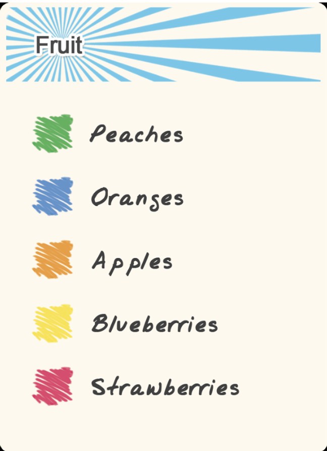
Original Topic Card

Original Colors
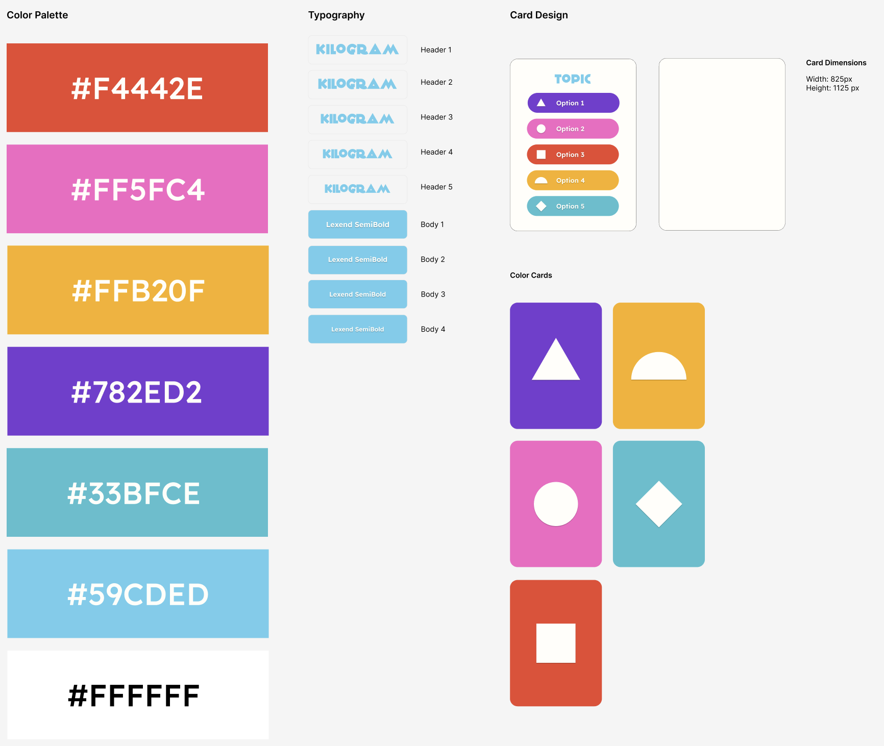
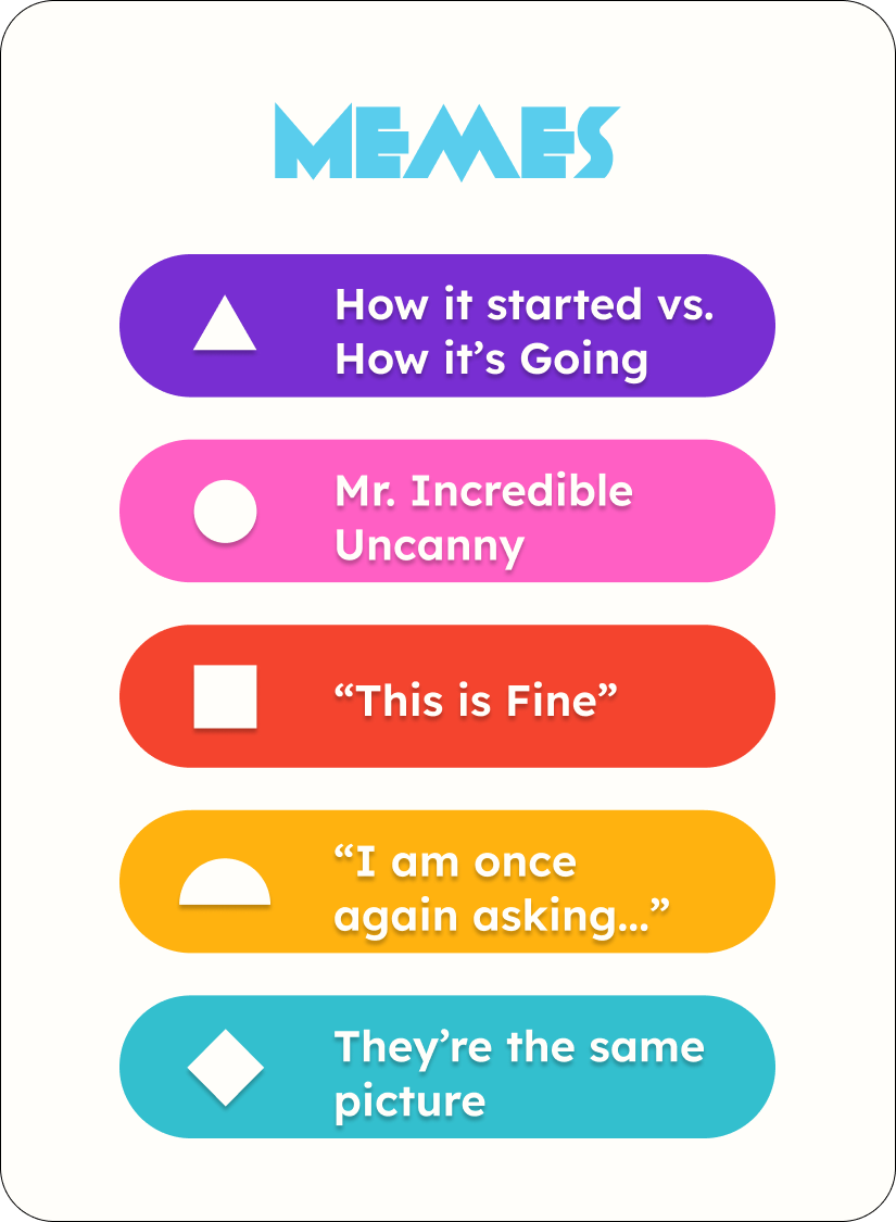
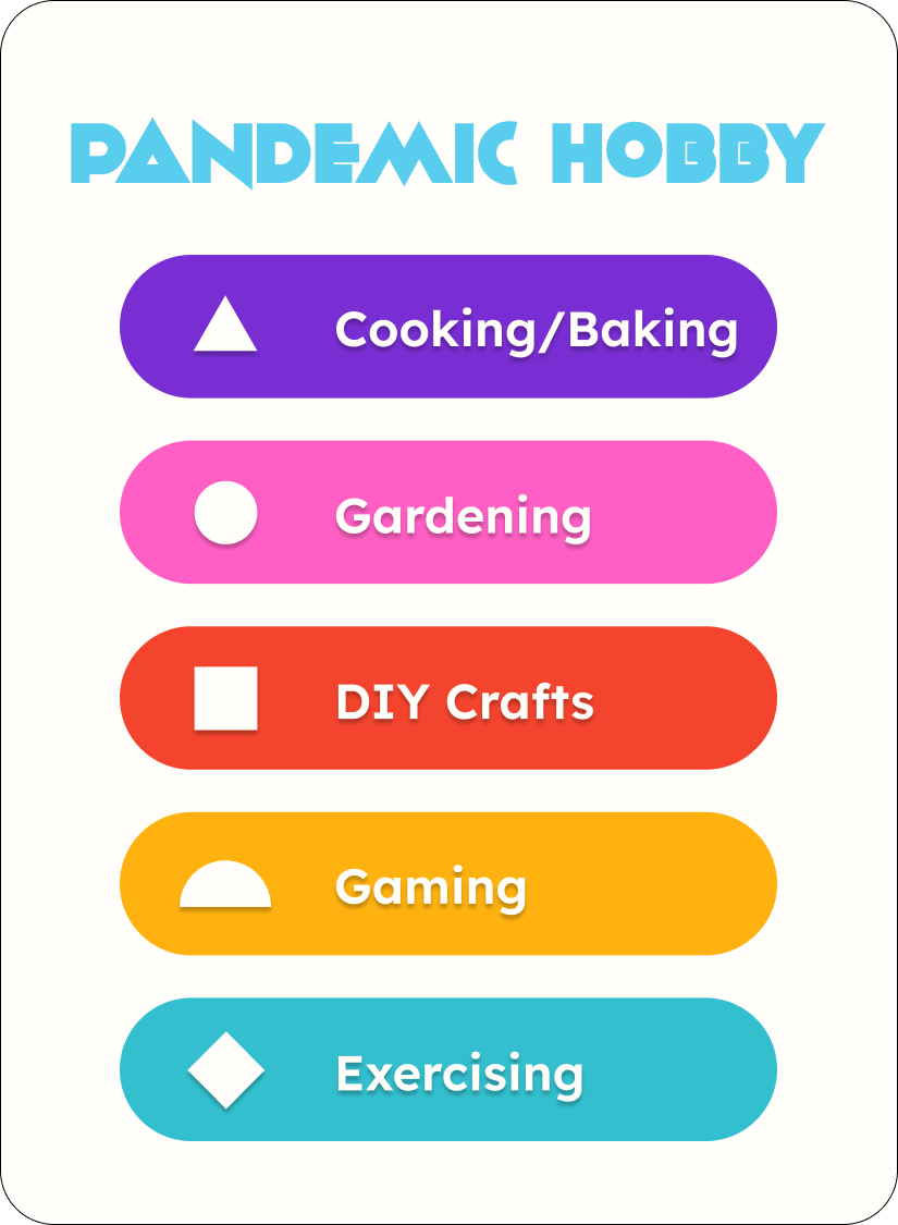
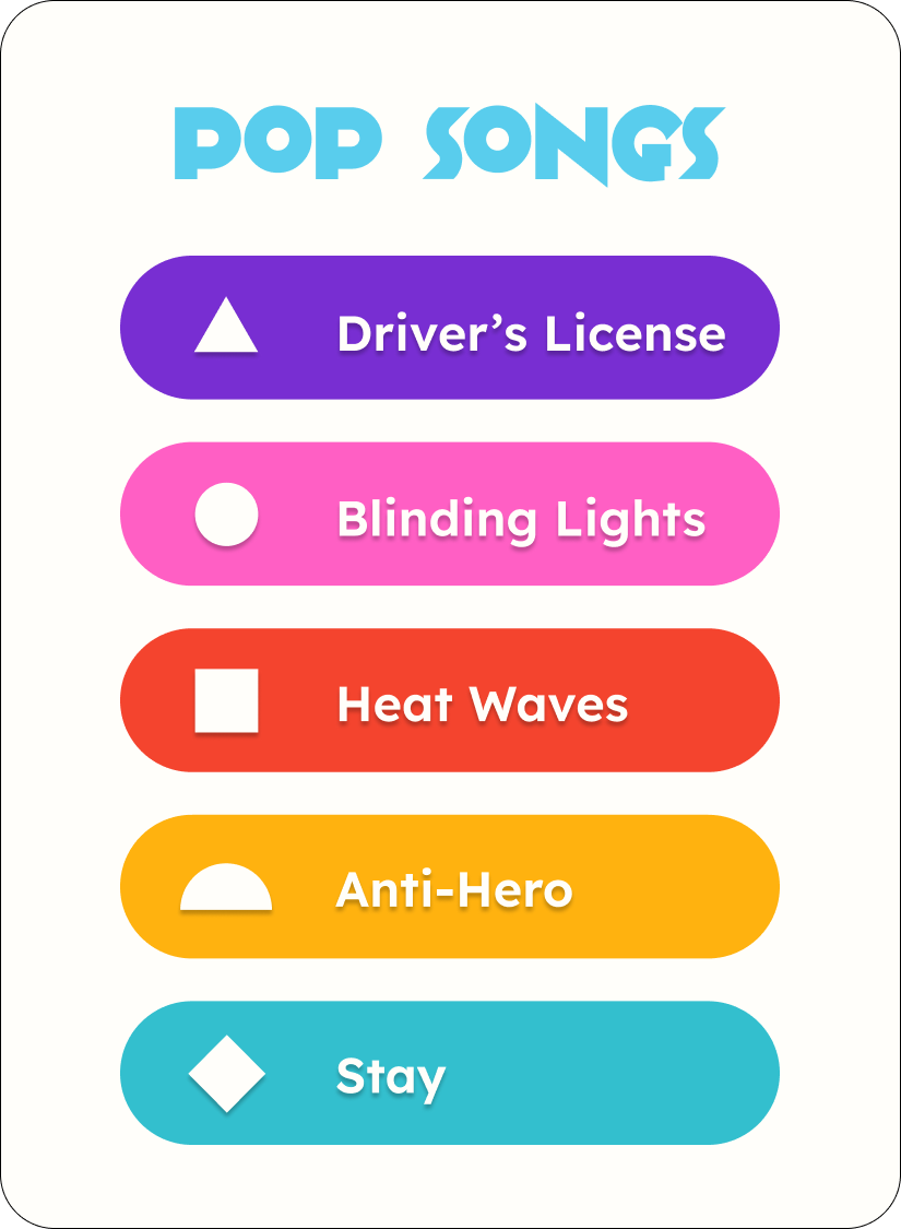
We started off by updating the graphics of the topic cards to be brighter and simpler to bring them into the modern day. We decided the colors should be brighter to match the fun and playful nature of Knowsy. The shapes alongside the options was to increase accessibility by considering users that may have issues with colorblindness. The font change was to match the playful feel of the game and increase the readability of certain letters that had issues with the original font.
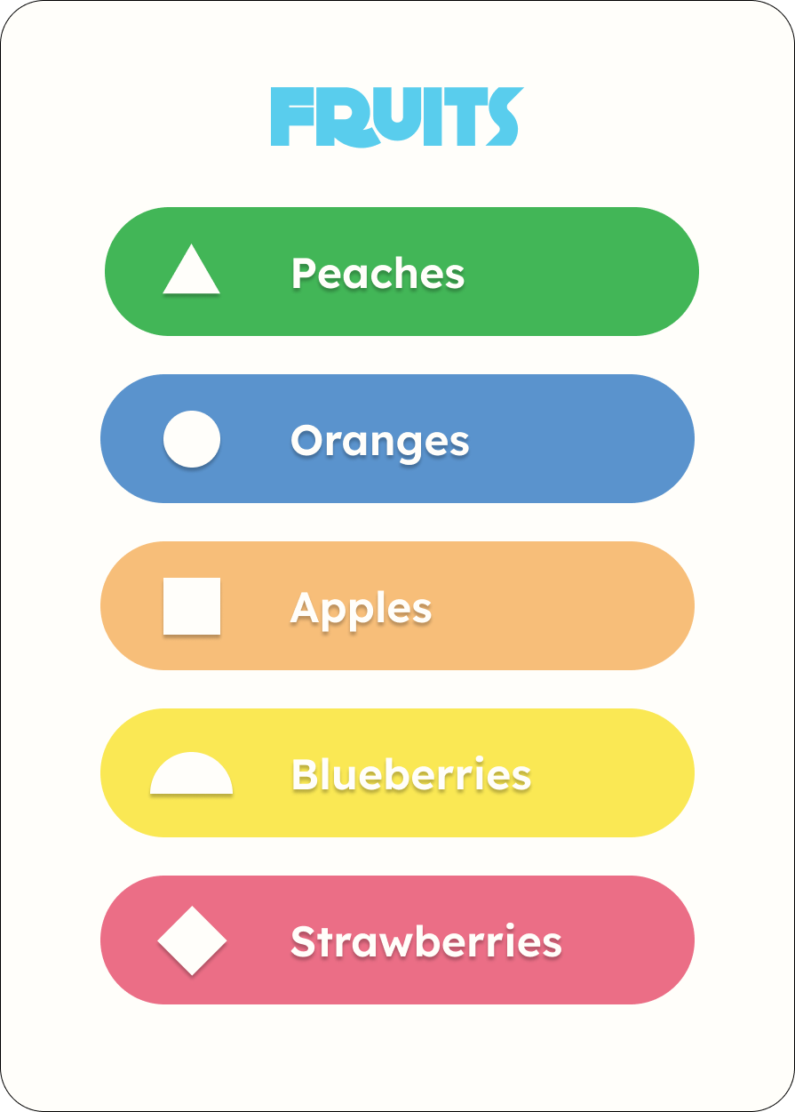
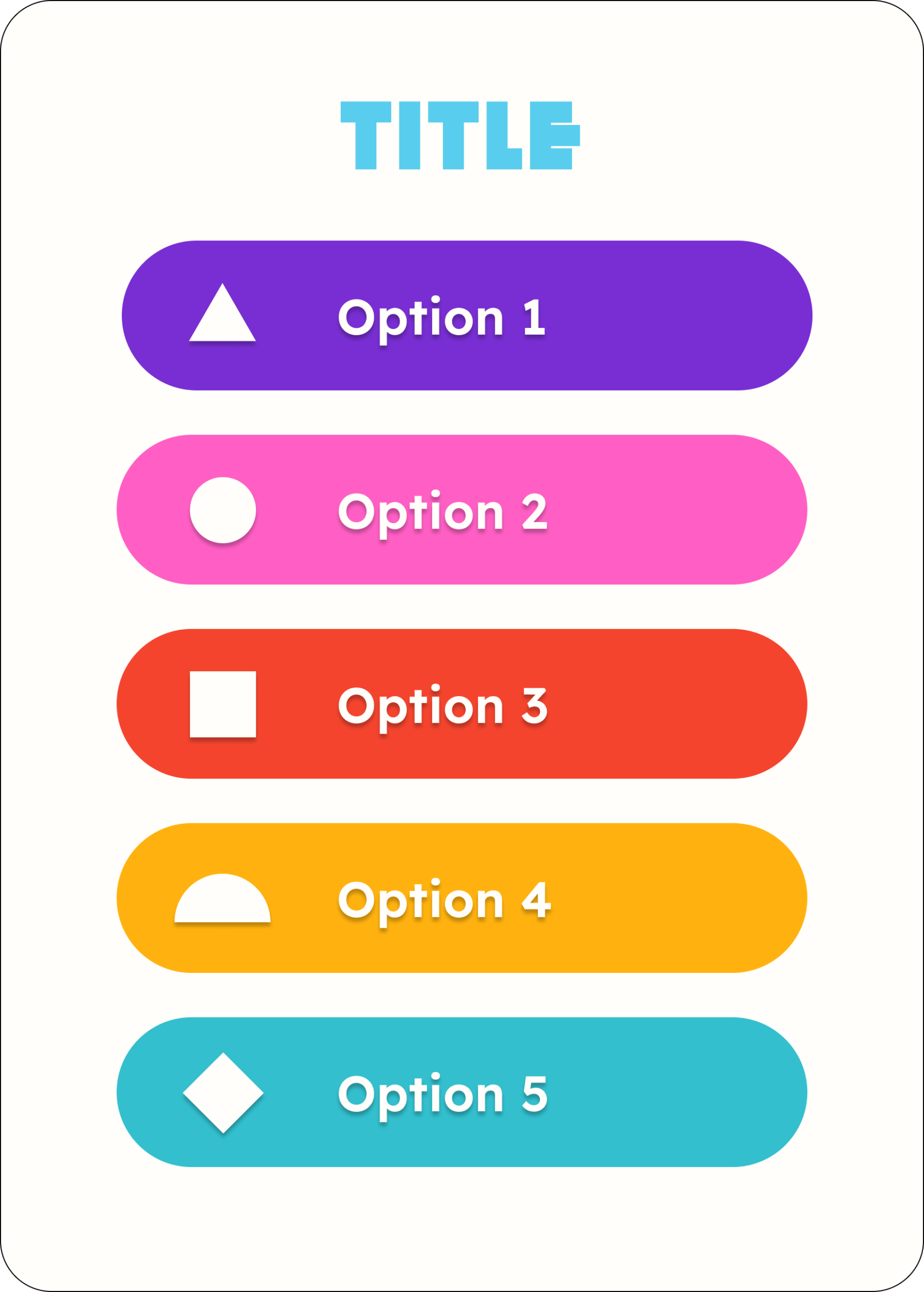
To create a fleshed out topic deck, we split up the work by assigning each team member with coming up with 10 topics with 5 options each, to end up with 50 topics total. The each person created the topic cards they came up with on Figma. These are a few examples of what the rest of the deck looked like.
Box Design
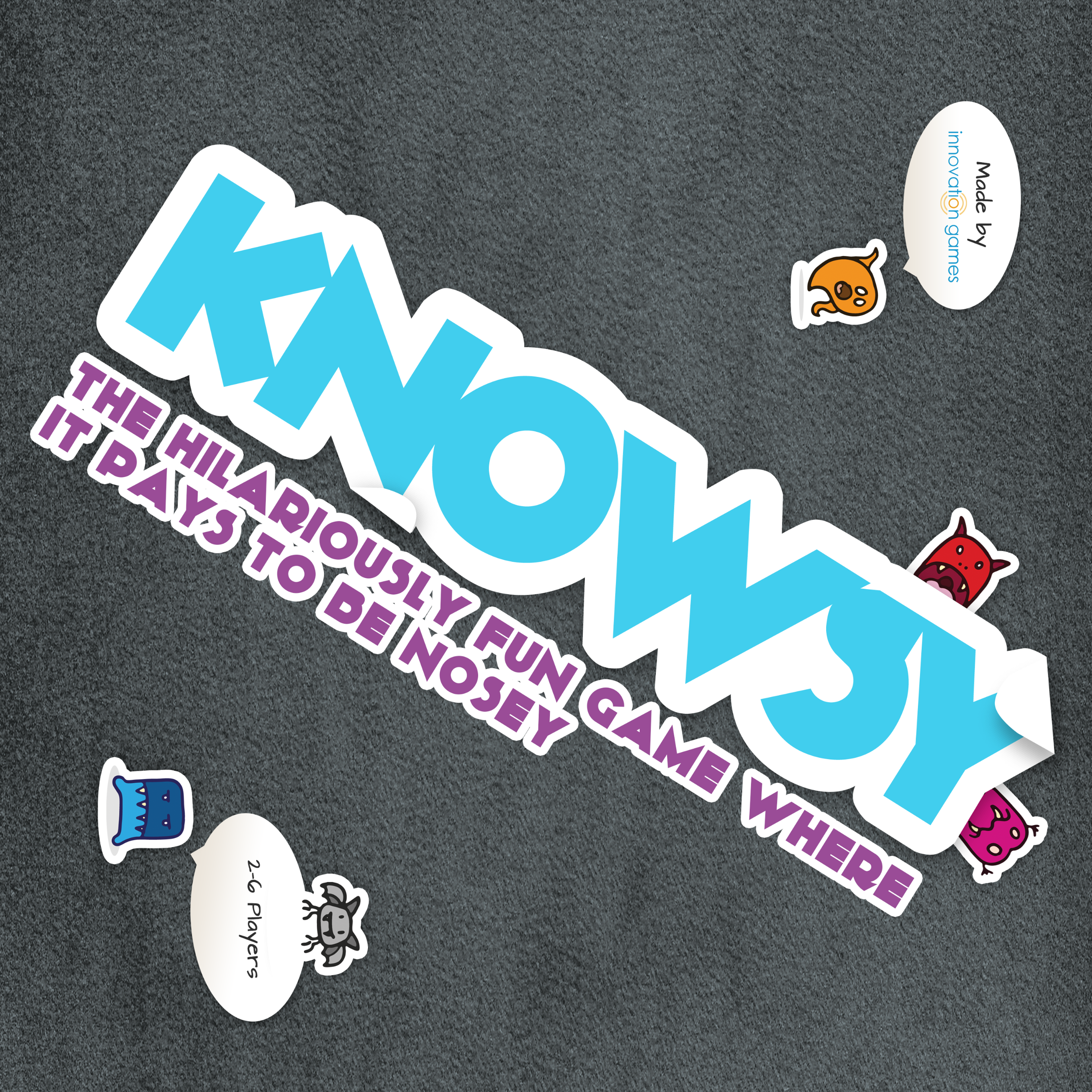
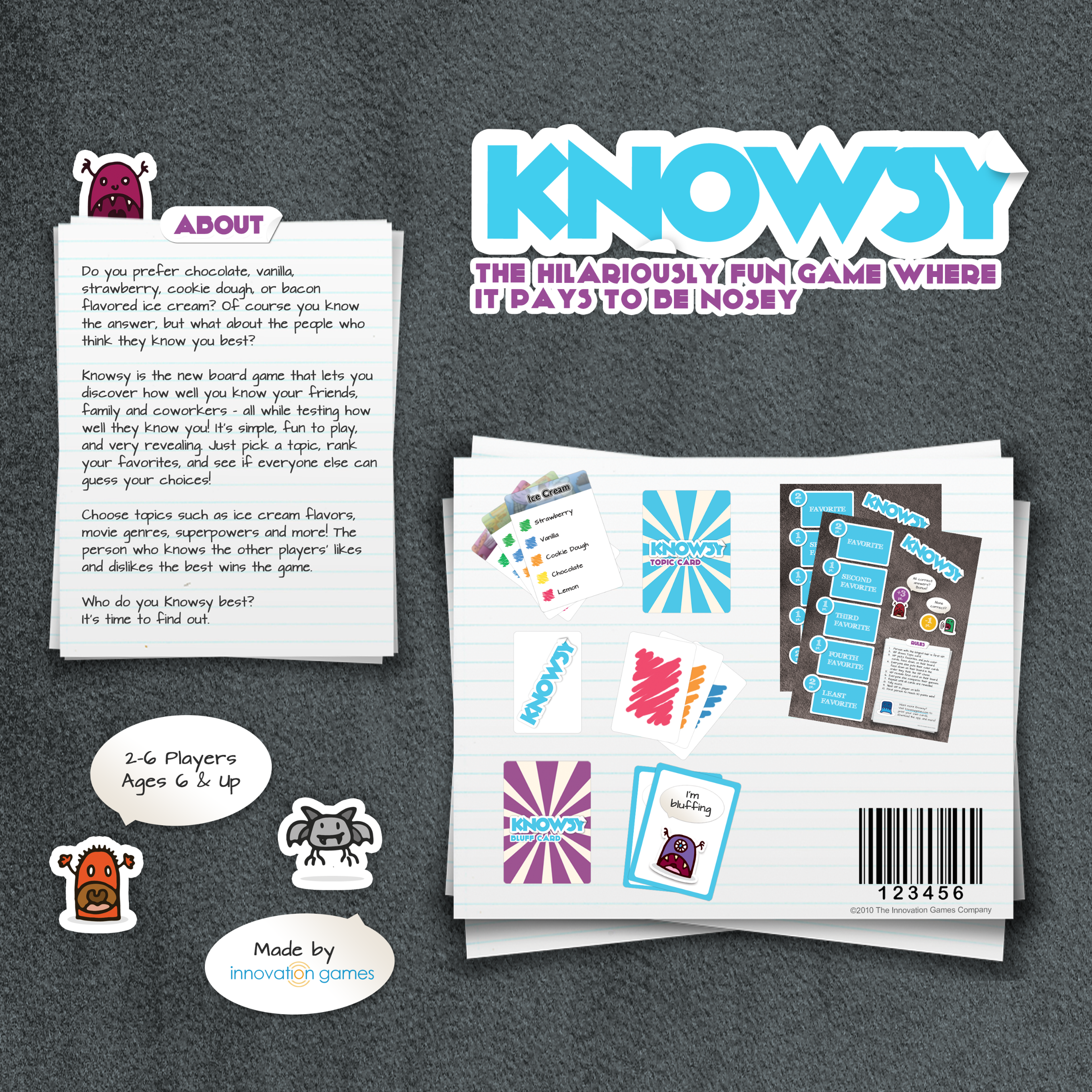
The original box design did not match the new style guide that we had developed so this also needed to be updated to match the new visuals. The layout of the new front box design was my personal contribution.
Original Box Design Front
Original Box Design Back
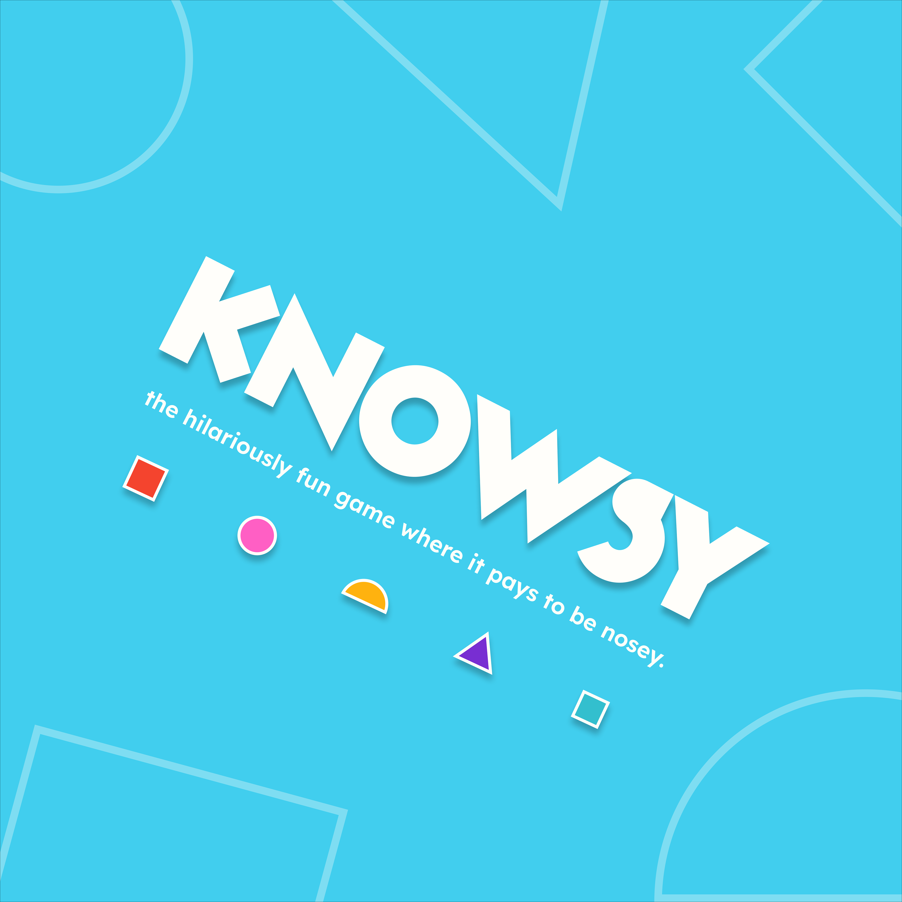
New Box Design Front
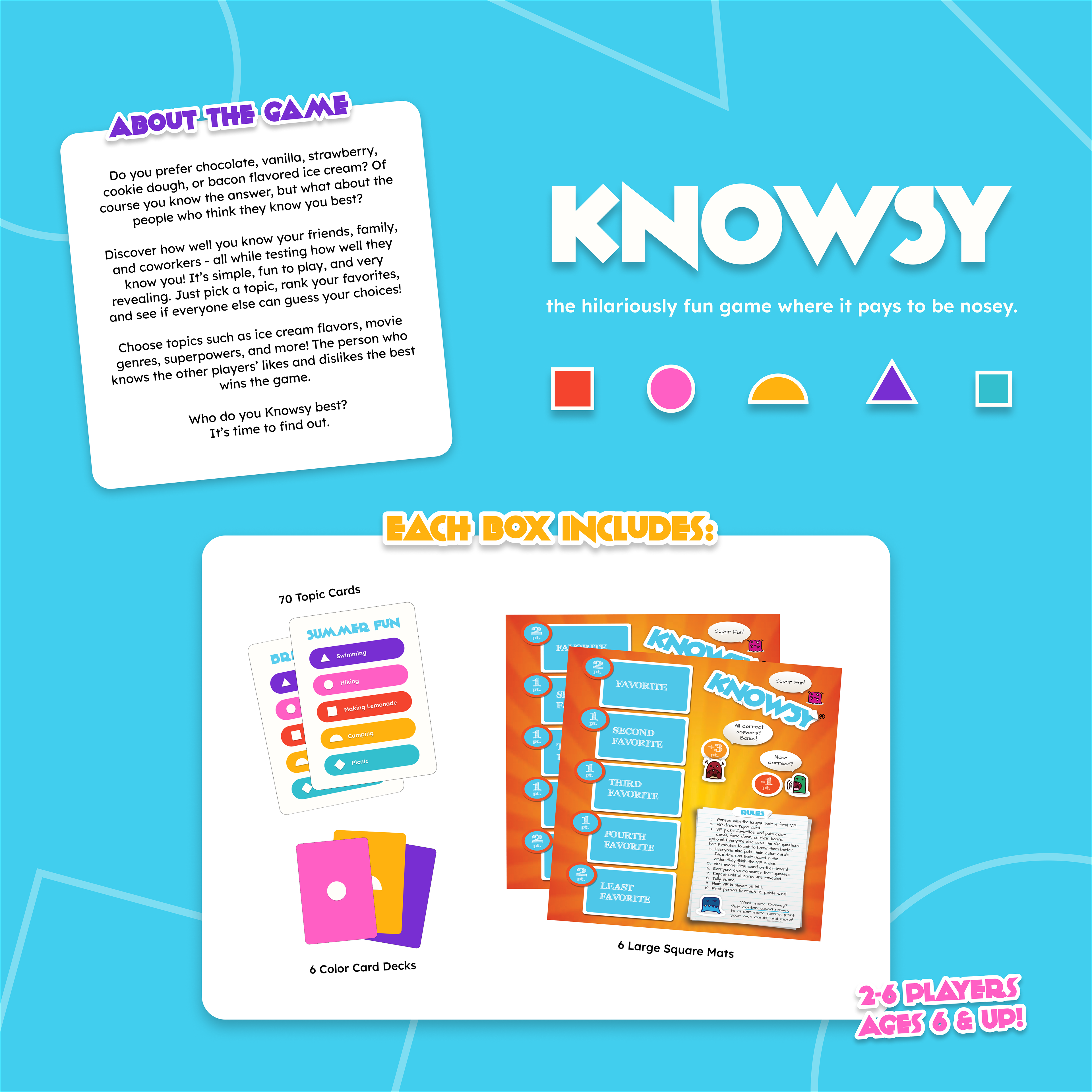
New Box Design Back
Mobile App
Competitive Playtesting and Analysis
Our team conducted playtesting to evaluate the gameplay of two parlor games similar to Knowsy. This activity would help us understand how digital parlor game elements facilitate a fun and collaborative gaming experience. Our goals were to learn more about how collaborative parlor games work for mobile applications and identify successful strategies from similar games, focusing on how core gameplay elements were maintained or adapted to optimize the user experience.
Mind Mapping
By viewing the games from the competitive analysis with a critical lens, we were able to pinpoint the features that were most significant in contributing to the gaming experience. From this analysis, we could connect the standout gameplay features to the games’ respective identities and purposes. We then decided to create a diagram to map out the key characteristics of Knowsy’s identity.
Creating a mind map helped us identify the key characteristics and features of Knowsy’s original game to emphasize and incorporate into our mobile app concept. Aspects like friendly competition and relationship building should be reflected in the mobile app’s gameplay mechanics and final design.
User Flow Mapping
Our competitive playtesting analysis and mind map helped our team identify key features to include in a mobile adaptation of Knowsy. Playtesting also provided us with a better understanding of how users might navigate through the different stages of a parlor-style game. Drawing from these insights, we began mapping out the user flow for Knowsy’s mobile experience.
Concept Sketching
Idea 1: Has a digital recreation of the physical game’s mat/board and cards, a timer, and labels for option placement
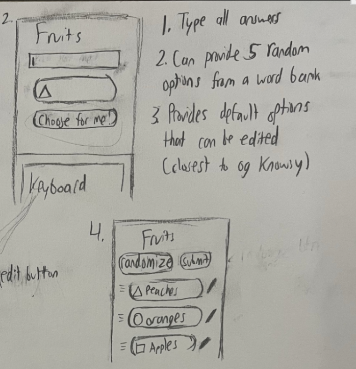
Idea 2: Provides default options that can be edited and options can be randomized or typed out. This would keep users from feeling limited by the given options in updated topic cards such as "Pop Songs" It also takes full advantage of the digital form of the game.
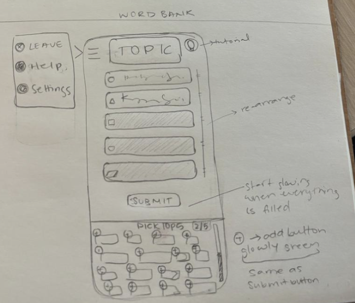
Idea 3: Has a word bank that allows users to add up to five alternative options
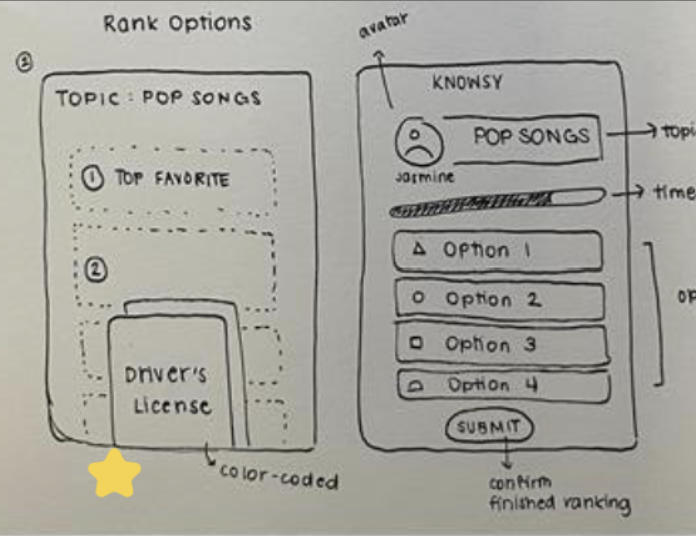
Concept 1
Concept 2
Concept 3
Based on feedback from our stakeholder we combined the best features from the 3 different concepts to 2. This allowed us to design a clickable walkthrough for each concept to communicate our ideas during testing.
Mid Fidelity Prototypes of Initial Concepts
Concept A is inspired by interactions from the original board game. Specifically, placing cards in designated spots on a game mat. Once the user is randomly assigned a topic, they are given a preview of the response cards, which they can shuffle through prior to ranking. As they place down each of their cards, a timer at the top of the screen visually indicates the time remaining for ranking. Users can rearrange the cards via click-and-drag interactions. Once the user is satisfied with their ranking, they can click the “Submit” button. A confirmation screen will appear, and the user will be asked to wait while other players finish ranking.
Concept B was based on Idea 3, which was centered around having a word bank feature. In this system, users can access the word bank via a pull-out menu and select the options they would like to rank. After selecting up to 5 options from the word bank, users can then rank their choices according to personal preference.
Results from concept testing showed that users liked specific features from both concepts, such as the visual clarity from Concept A and the word bank system from Concept B. This gave us clear direction on what the final prototype should look like.
Final Prototype
Our goal was to create designs that merge Concept A’s UI and Concept B’s word bank feature and design a prototype with minimal interactivity to visualize the ranking process. We began by identifying the key features to include in our final design concept. Our reiterated wireframes (shown below), expand on concept B’s word bank feature for option selection and click/drag functionalities while incorporating the interface style of concept A. We considered several options for the word bank’s visual format, which were presented to our sponsor. We explored several visual formats for the word bank, which we presented to our sponsor. After discussing the options, we selected a layout with a more randomized pattern and varying option sizes for the final design. We built on the reiterated low-fidelity wireframes to include the process of selecting items from the word bank and to illustrate the process of replacing given options. During this stage of the design process, we also experimented with adding basic interactivity to different UI elements using Figma’s prototyping tools.
Our mid-fidelity prototype essentially served as a skeleton, allowing the team to quickly flesh out the design into a higher-fidelity version. A key focus during this phase was adding specificity, such as replacing generic labels with game-relevant text (e.g., changing “option 1” to “Driver’s License”). We used our style guide to refine the visual elements, incorporating colors and fonts, and ensuring that items like buttons and symbols aligned with the overall UI and visual style. This final high-fidelity version is displayed at the top of this page!
Limitations and Final Takeaways
Due to the time constraints of this project, we had to keep our scope focused solely on modernizing Knowsy. This meant that several of our sponsor’s ideas and suggestions could not be incorporated into the final design. The most frequently discussed ideas from our sponsor were 1) the inclusion of iconography/images within the word bank and 2) utilizing Knowsy as a tool for tracking trends in user preferences. However these ideas were outside of the scope of our project and could be potentially implemented in the future.
This project taught me a lot about the value of data and research in a UX project. Before Purdue my idea of UX design was very focused on the design portion, but projects like this one force me into the reality of UX work, that majority of it consists of researching, testing, and reiterating. Designing and sketching makes up much less of a UX project than an average person would think. But it was the Knowsy project that helped me feel the satisfaction and pride that came with seeing your research and workshopping pay off in the final product when it significantly improves the appeal and usability. I can confidently say that I have a much deeper interest and appreciation for what I thought of as the "mundane" parts of being a UX designer.