Project Description
The goal of this project is to design a digital space tailored for FordLabs employees for recognizing birthdays, accomplishments, milestones, and other events. The final product will also provide FordLabs employees with a cost-effective, collaborative, and user-friendly platform to celebrate each other within the organization.
The existing platform that Ford Labs is using is called KudoBoard and is too expensive and complex for the user's needs.
Personal Contributions
Note taking for all meetings and workshops, playtesting, secondary research, workshopping, mind mapping, affinity diagramming, documentation, sketching, and prototyping mid-fis and high-fis
Researching and Ideation
KudoBoard Demo
To understand FordLabs employees needs in the final product, we first familiarized ourselves with Kudoboard, their current online recognition platform. The team delved deeper into gaining more understanding of Fordlabs employees' work culture and needs, crafted meeting plans, gathered intelligence, and pinpointed essential features for a collaborative online employee recognition platform tailored to a corporate environment.
We discovered what features Kudoboard offers FordLabs employees such as facilitating celebration and recognition of colleagues. It also allows users to create digital boards on which they post messages, photos, and other content.
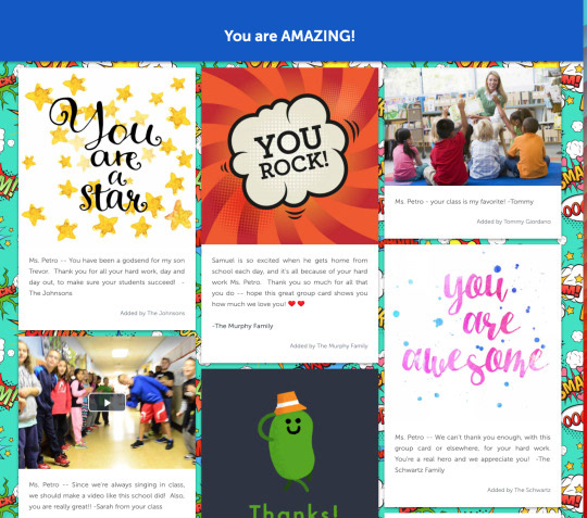
Example of a Board from KudoBoard
Competitive Analysis
The goal of our competitive analysis is to explore ten employee celebration platforms similar to Kudoboard. We broke down each platform by features, price, and board types, and compared them to Kudoboard. This helped us identify features to include in our model, understand Kudoboard's significance, and help with our decision-making process.
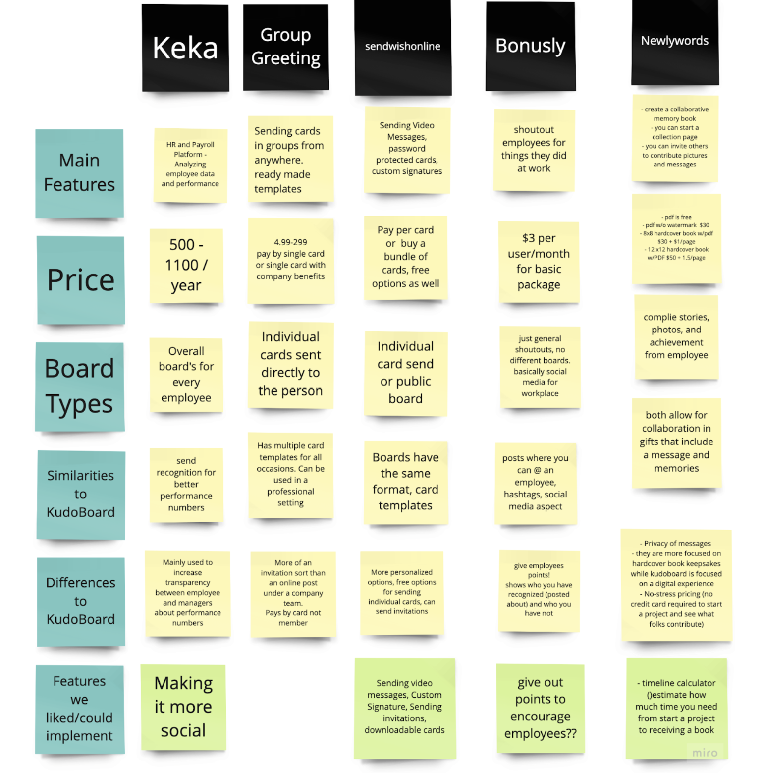
Competitive Analysis
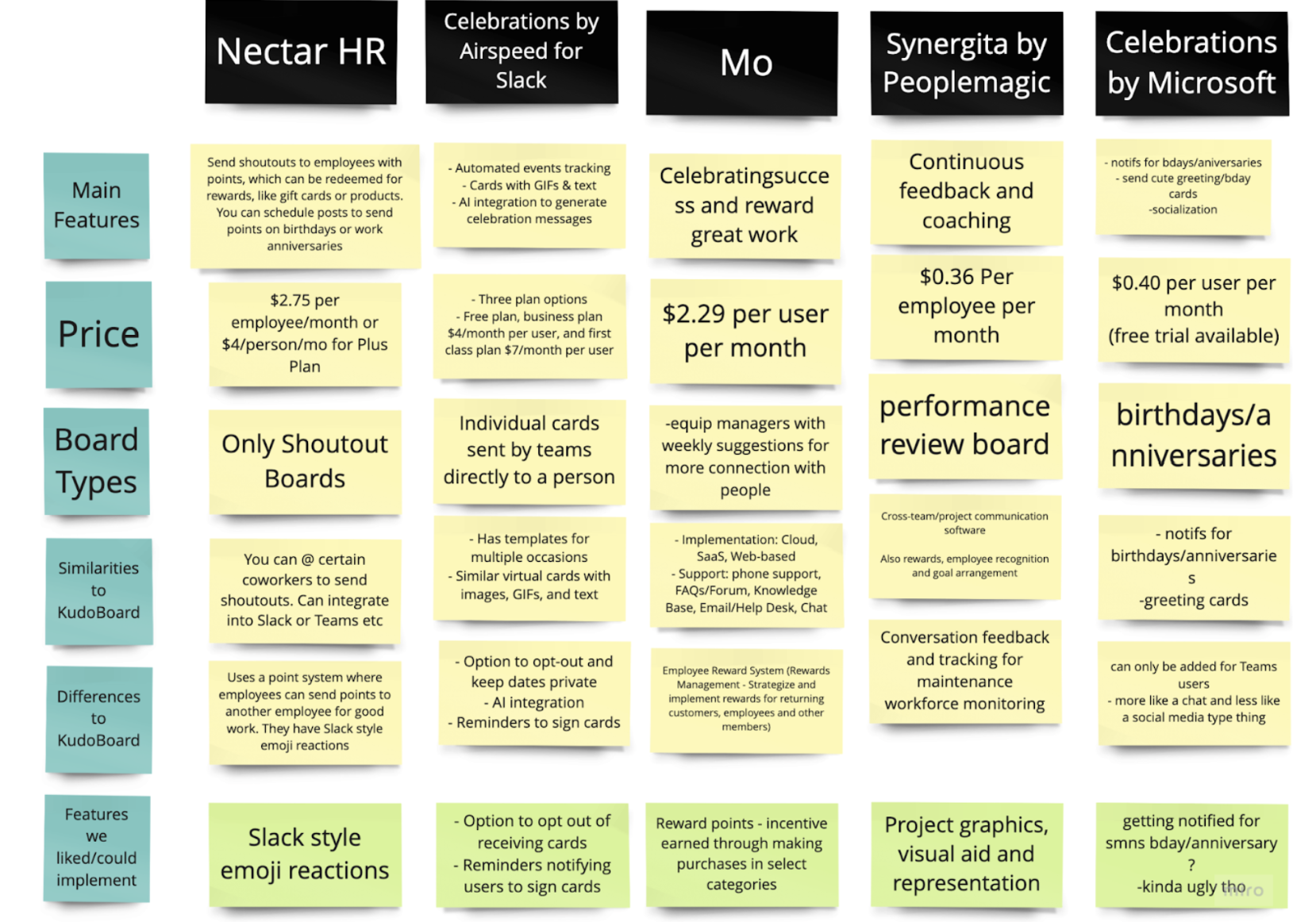
Competitive Analysis
From our research, we found 3 major features we like to add to our design:
1. Adding a calendar feature to track birthdays, anniversaries, and work events would improve organization within our platform
2. Possible point system, initiated by managers rather than being transactional, could also enhance our platform
3. Allowing gift card donations within birthday posts for users to show appreciation for one another
Interviews with FordLabs Employees
We interviewed 5 employees at FordLabs and our findings can be put into 2 categories:
Culture:
They have weekly meetings where shoutouts usually happen, bonding activities surround games (usually serving as icebreakers or after-work gaming sessions)
Features:
The platform should be quick and easy to use, have gifs, emoji reactions, and themes. One thing that's missing from KudoBoard and employees want is calendar notifications.
Sketches
We started to sketch out the ideas that we had based on all the research we had done by conducting a sketching exercise called crazy 8s. As a team, we go through 8 rounds of sketching of 1 minute each. The featured sketches best represented the features and design the team was looking to further develop.
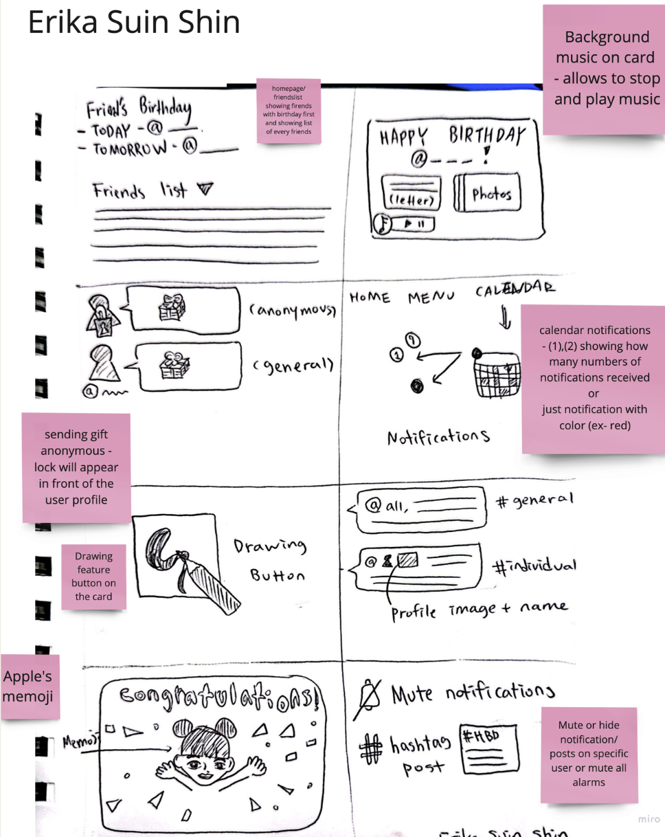
Sketches
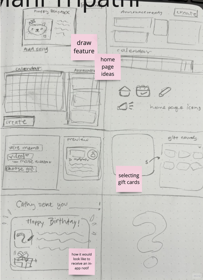
My Sketches
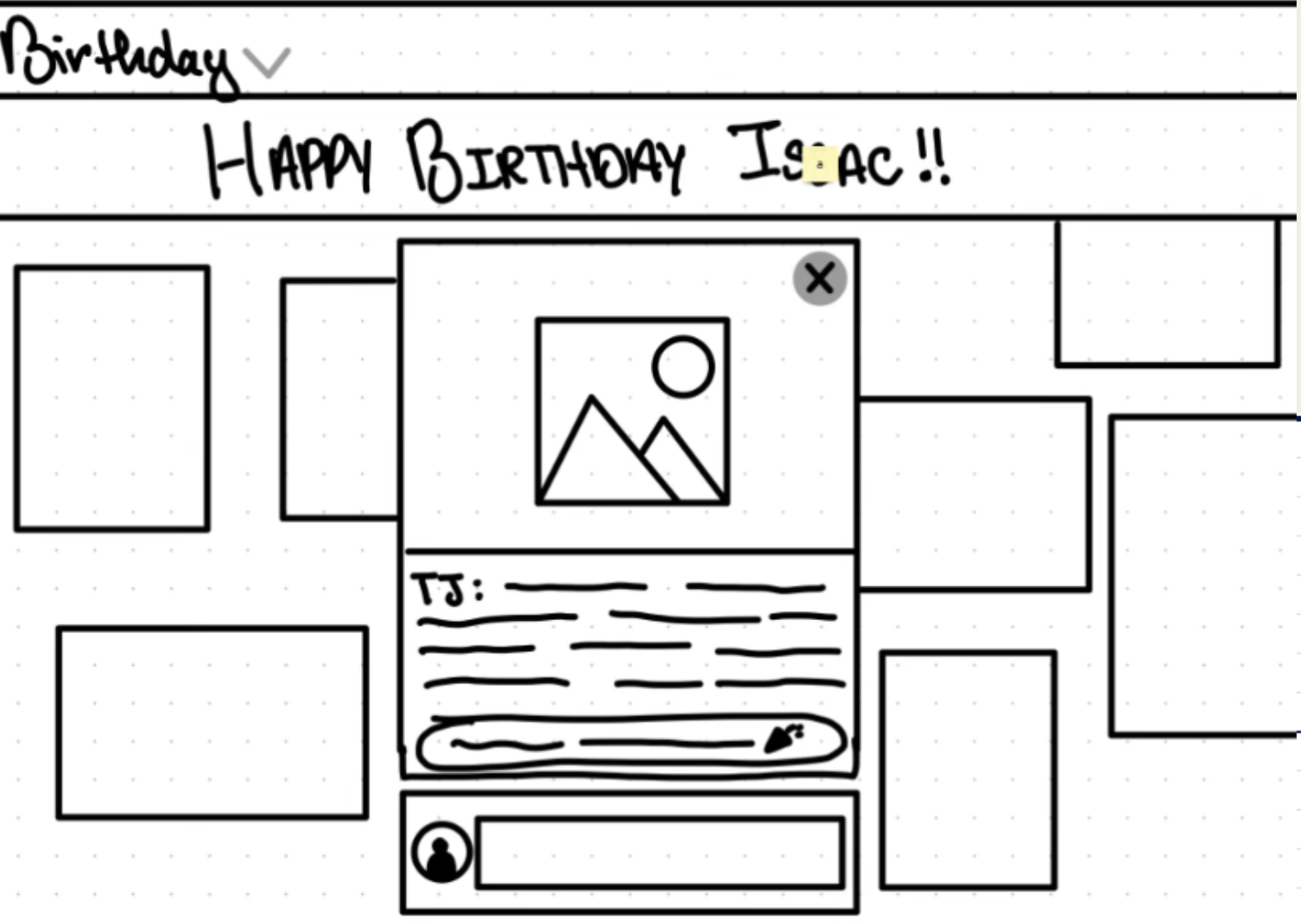
Sketches
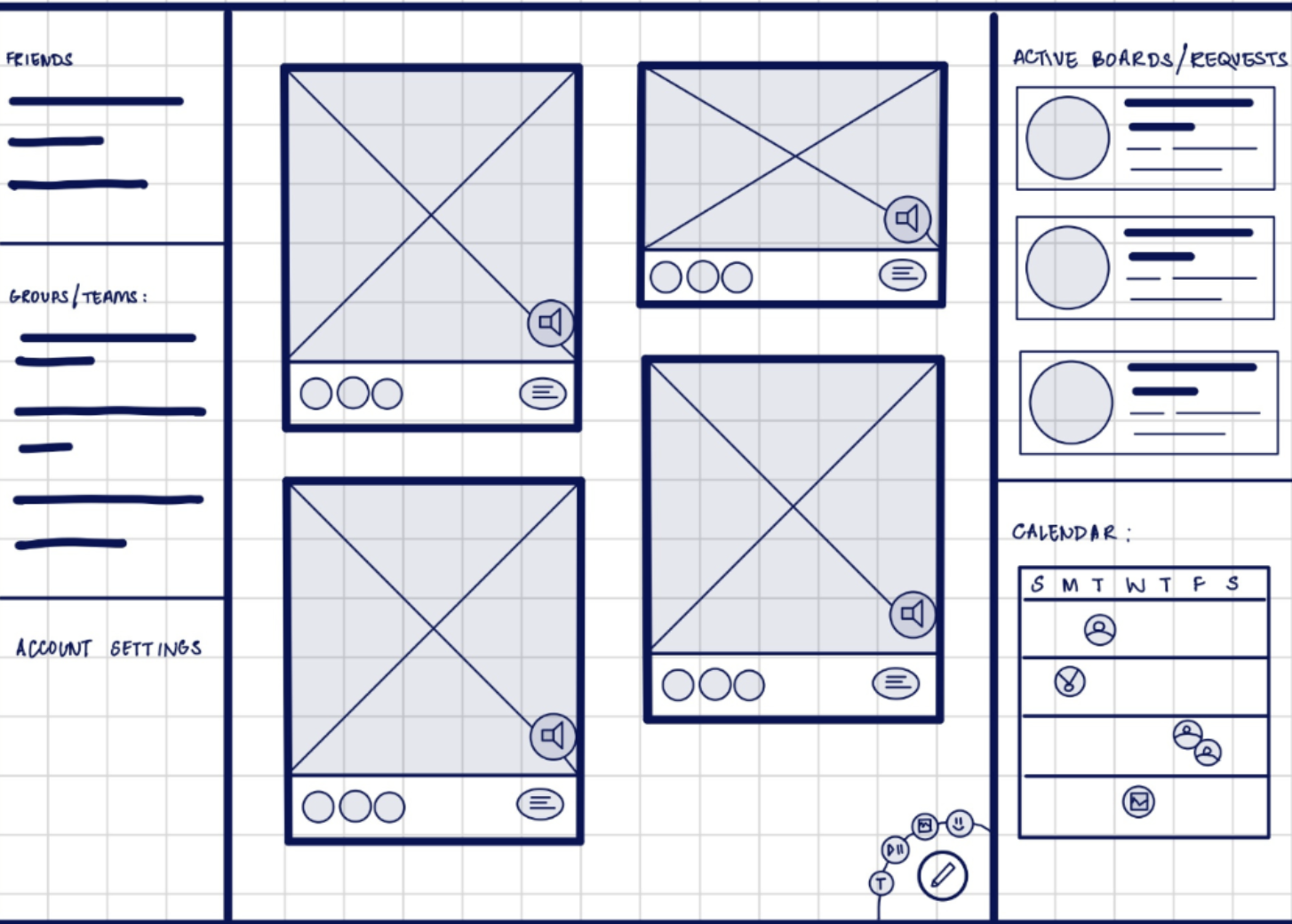
Sketches
Wireframing and Prototyping
Site Flow
The goal of our site flow is to understand how we want FordLabs employees to navigate features seamlessly in the website to create a board for celebrating and recognizing their co-workers. Our team developed a site flow to visualize how the site might look and function, drawing from our previous sketches and findings. We realized the need to categorize screens into 3 main sections:
1. Homepage
2. Viewing board
3. Creating a board
Mi-Fidelity Wireframing
We wanted to create rough outlines for our site design based on prior takeaways and utilize prototypes for usability testing. With the information from our site map, the team split up pages for each group member to create. We all contributed to the homepage of the web app, taking into consideration our sketches and wireframes. When designing, we prioritized the layout of content and simplification of information rather than design and aesthetics. We also kept in mind our user interviews when deciding which features to highlight.
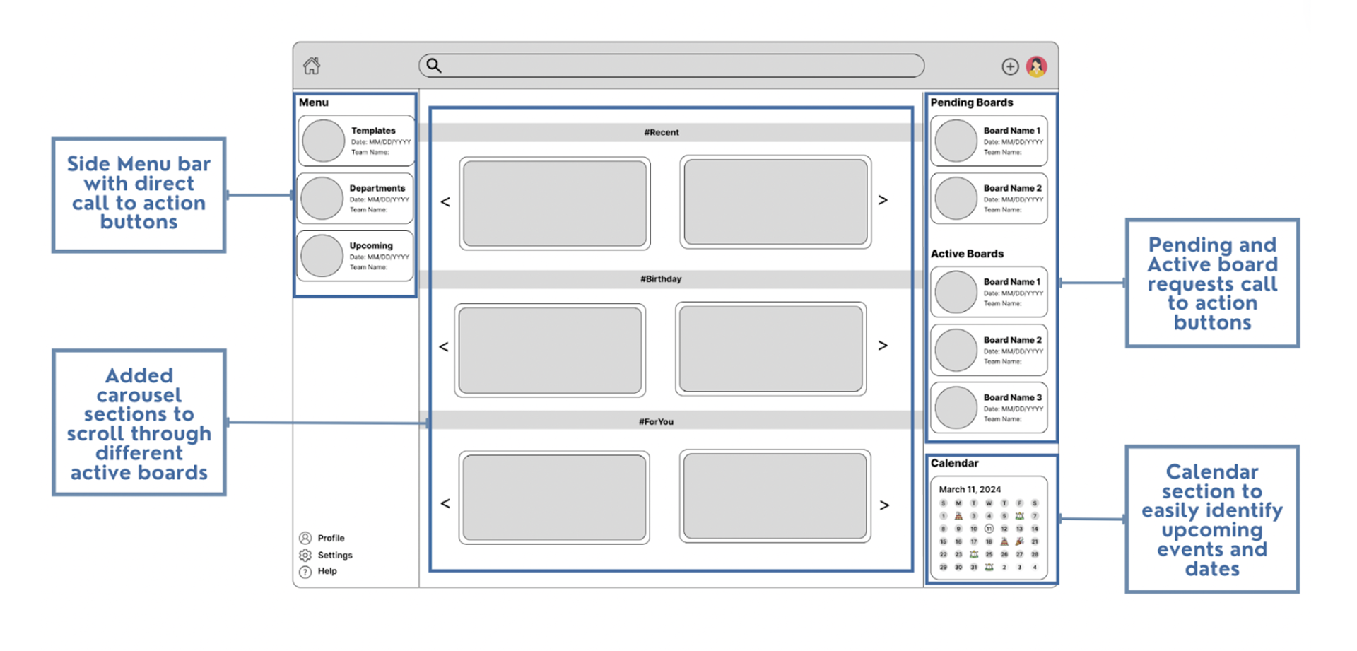
Home Page
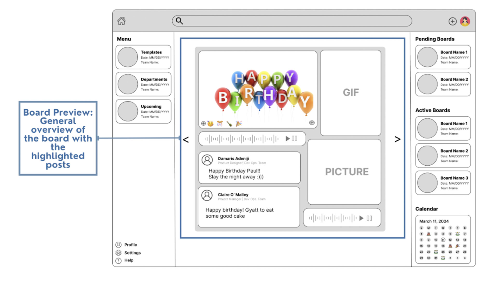
Board Preview (Home Page)
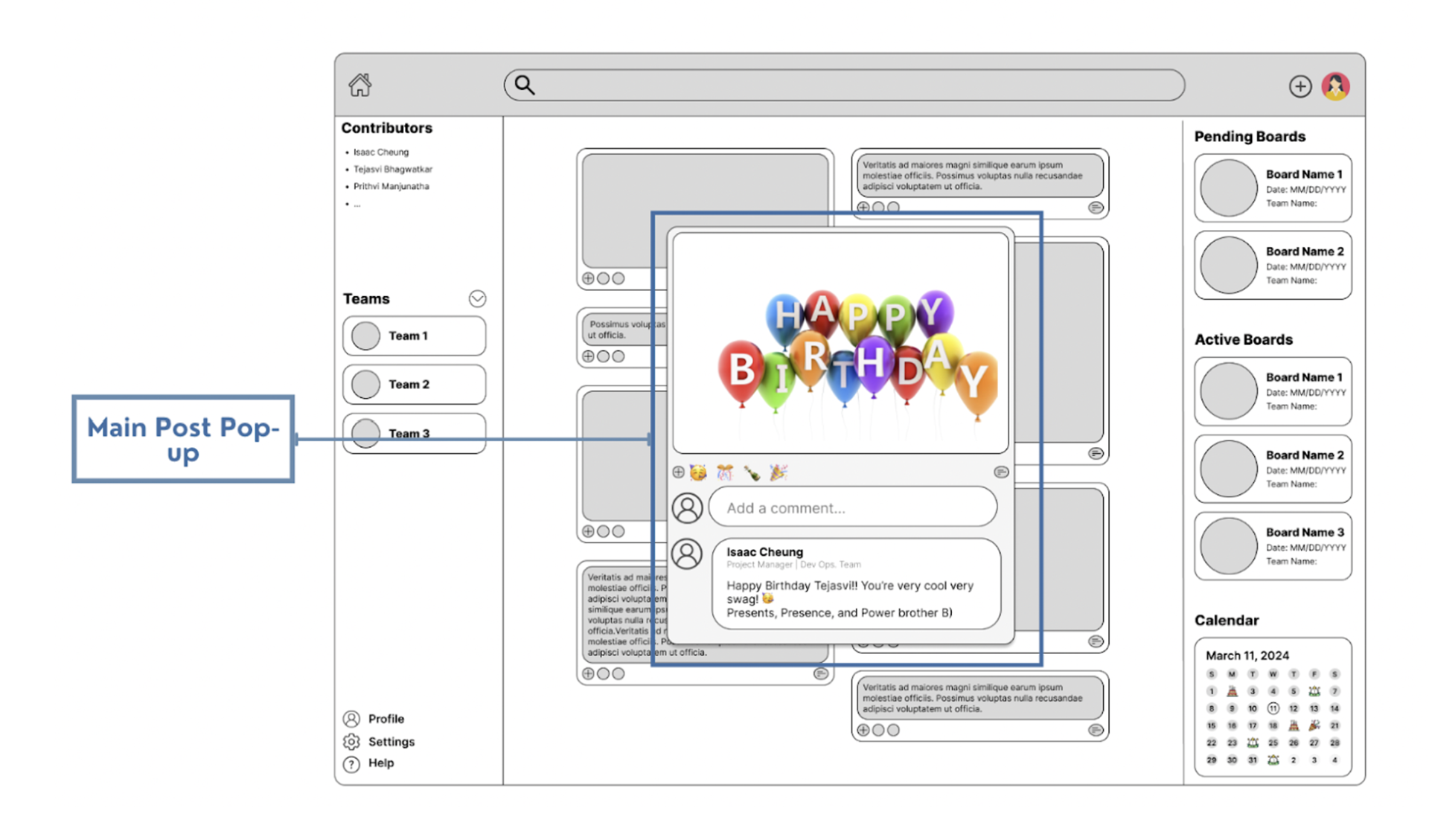
Main Post pop-up (Viewing a Board page)
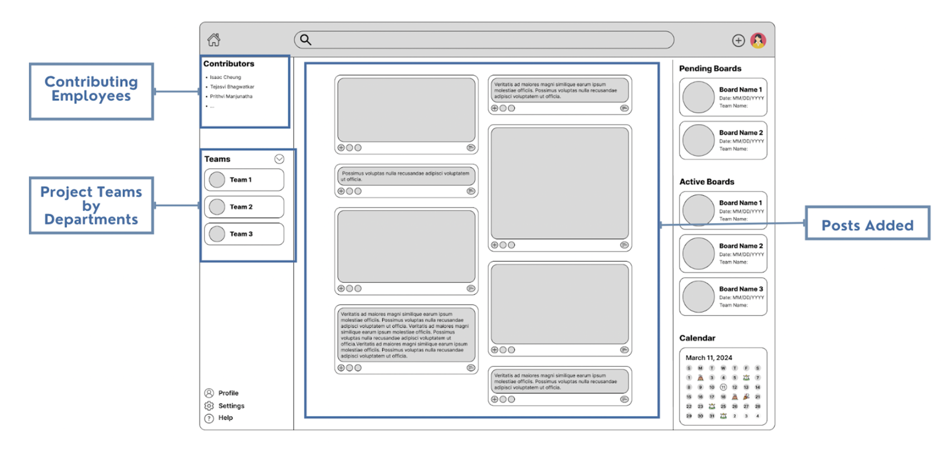
Viewing the Board
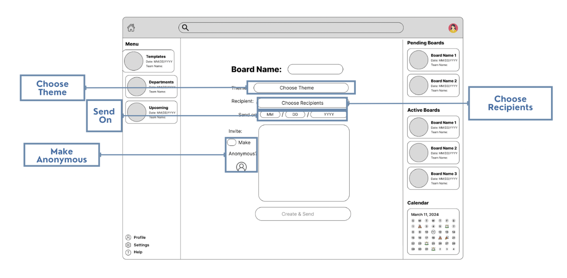
Create a Board Page
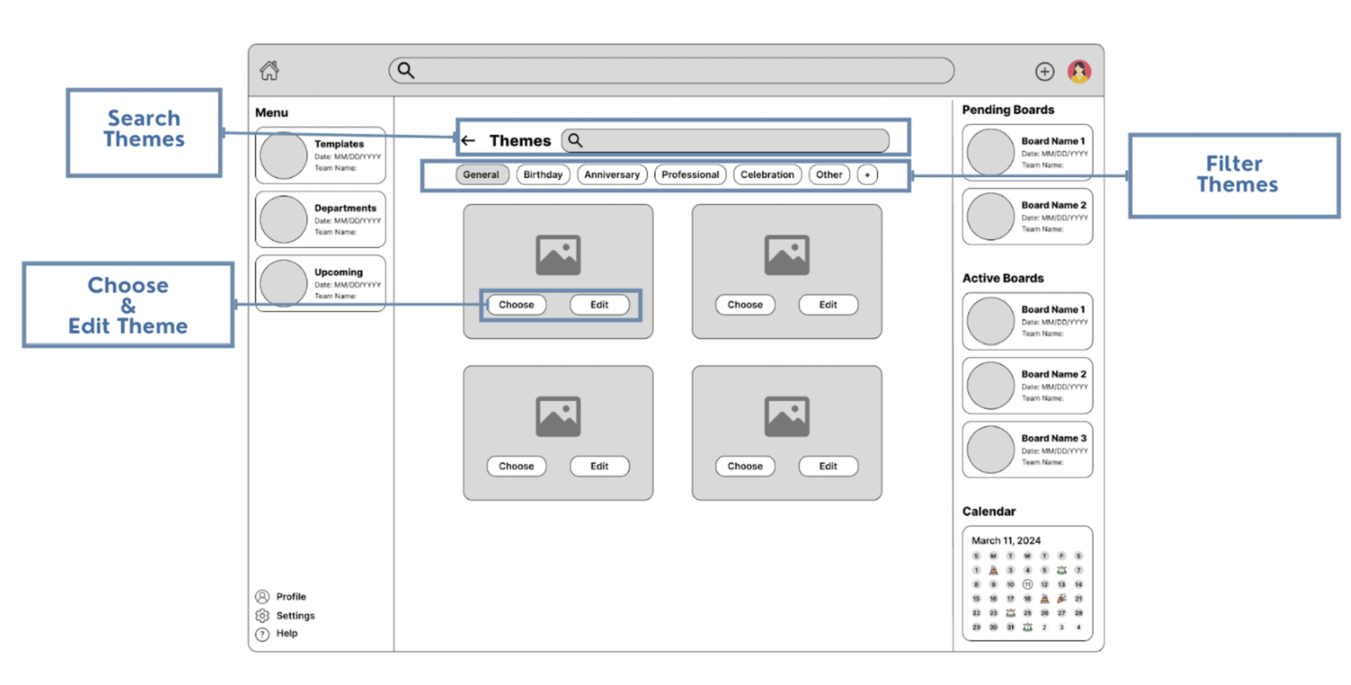
Picking a Theme
Mid-Fi's Concept Testing
We conducted 5 user tests with Ford employees by creating a protocol. We had begun our protocol by assigning a Think-a-loud scenario to the user, guiding them on overall site flow to imagine the scenario and to go over the overall mid-fidelity wireframe.
Our Takeaways:
1. The home page side panels are overly cluttered
2. Hard to distinguish between pending and other boards
3. Adding an invite box on the post page will enhance clarity
4. Like the idea of voice and music recordings
5. Unclear what hashtags signify
6. The date is difficult to see with emoji blocking it
7. Some of the boards lack consistency with each other
8. The welcome page is necessary
9. Need to prioritize naming conventions
Hi-Fi's Concept Testing
Based on the findings from the first round on concept testing, we revised our site flow and redesigned the portions users said were unclear or needed improvement on the final high fidelity prototype. It can be found at the top of this page!
Once we had a completed hi-fi prototype, we used the same user group as before to conduct another round of concept testing. We had aimed to make this platform work a bit more seamlessly. We wanted to improve the transitions from interface to interface, improve the aesthetic, make the platform as usable as possible, and clear up any confusion that is present within the current design.
Approach:
To gather these insights, we had created a high-fidelity usability testing protocol. This protocol runs through first impressions, general questions, desirability questions, and scenarios. We interviewed an employee in Fordlabs to gather thoughts on all of these sections within the protocol.
Our Takeaways:
1. Make the “board name” field easier to understand
2. Confusion of whether “create board” is navigational or a button
3. Confusion of the select button on the recipient's page
Final Takeaways
This is the first long-term group UX project I got to work on and I am so thankful for my wonderful team members and the upperclassmen that provided mentorship and guidance. I learned so much about Figma and prototyping interactivity into wireframes. I understood just how much research, iteration, and documentation goes into a high quality project. One part of these types of projects that surprised me was how many hours go into documentation. I wasn't aware of how much attention to detail it required.
I am also grateful for the experience of working in a team setting and collaborating with a large team. This project had 10 people working on it and we had to find a way for all of us to contribute meaningfully and manage the workload equally, but also according to each person's skillsets and experience. The studio class that assigns Purdue UX students with semester-long projects challenges us in many ways, but thanks to my talented and thoughtful team, I had a great first experience managing all these different factors.